
We know things aren’t easy right now, for anyone. As we struggle to make it through the next few days, weeks, and months together, we at Artemis promise to do the thing we can control – we can keep building useful tools for you and we can keep supporting you through all of this uncertainty.
Over the past few months, we’ve been hard at work building new reporting functionality. Growers want more ways to better look at their farm data and use it to make smarter decisions. We heard your feedback and we’re excited to introduce you to our new advanced Reporting feature. Here are five ways you can use our new Reports feature.

Flexible data measures
Now you can select which data type you’d like to view and toggle between sum, cumulative, and average measures for that data type. For example, you may want to see cumulative yield harvested in a month to see how you’re progressing on targets or you may want to see the average temperature in your facility (or in one particular area).

More groups and filters
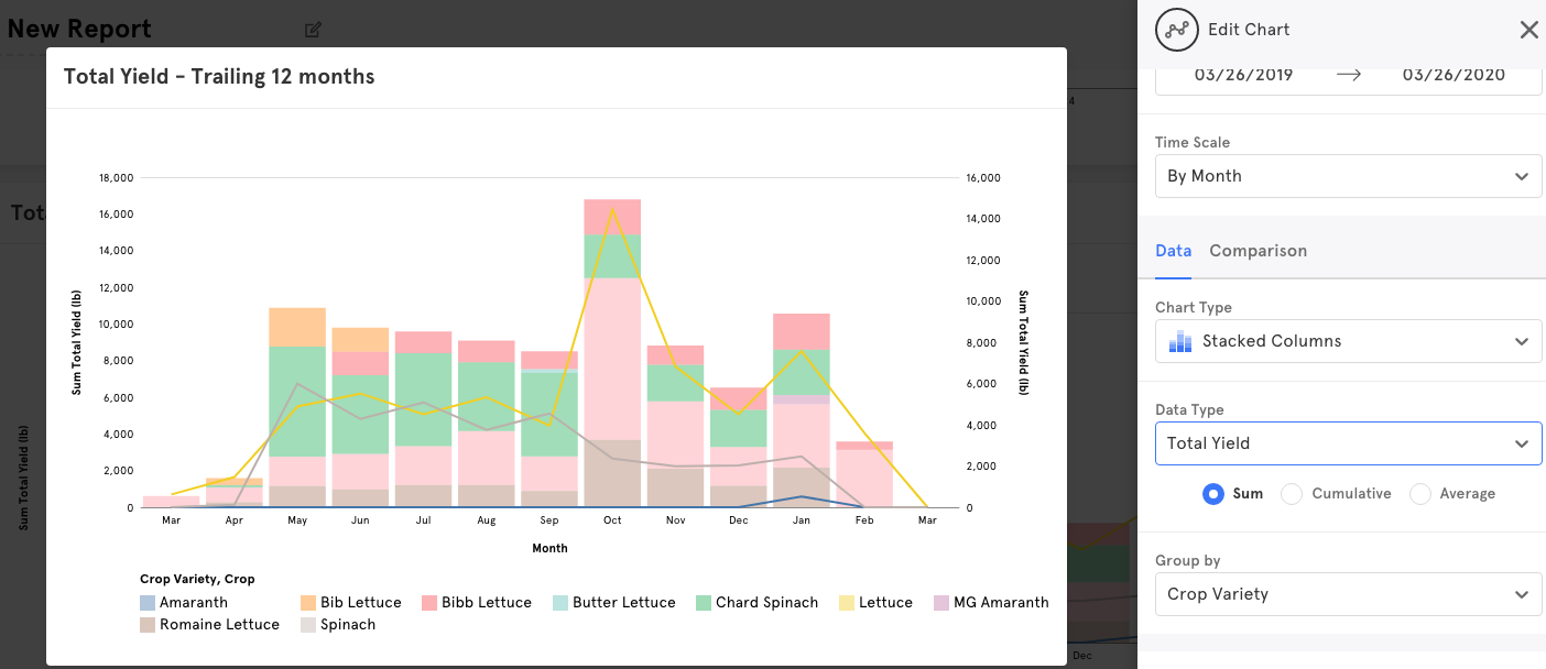
We’ve added two new ways to break down your sets of data: groups and filters. This makes it incredibly easy to pick and choose the data types you’d like to analyze. For example, you can group by employee to show the yield harvested by each member of your team and you can then add a filter to select only yield harvested by one (or a few) of your employees. You could also do this for crop and crop varieties, as shown below.


Comparisons
It’s now possible to compare two different datasets. If you’d like to pull metrics and compare them against yield or loss, you can do that by using the comparison tab. It’s also possible to use groups and filters in the comparison. For example, if you want to see how pests are affecting yield loss for a specific crop variety or strain, you can show a comparison of a pest count with yield loss filtered to a specific crop variety or strain.

New chart types
We also added new types of charts so you visualize your data however you’d like. You can now use stacked column, horizontal column, line, or area charts to analyze your data.

More ways to share charts
We know how important it is to make charts shareable, so we’ve added the ability to export the raw data from each individual chart and also the ability to export an image of the chart. You can always give additional users access to Artemis (we don’t charge by user) if you want more people using Reports in the platform, but in case you want to drop a chart image into an email and send it off, you can do that easily now too.

We’re still building and we’re continuing to add new functionality to Reports (and throughout our platform) to provide you with visibility into your most important sets of data. We’d love to hear your feedback. If you’re looking to roll out a cultivation management platform this year, give us a shout and we’ll show you the new Reports. You can reach out to us at: sales@artemisag.com.

Leave A Comment