

iUNU is excited to announce a series of improvements to Artemis’ reports page that make it easier for customers to access and visualize the information that they need.
Users have long been able to create charts that are grouped by one category (e.g. crop type, zone, batch unit). Users loved this feature, and many requested the ability to group chart data by more than one category. Now you can! For example, this chart is grouped by crop variety and sub-zone.
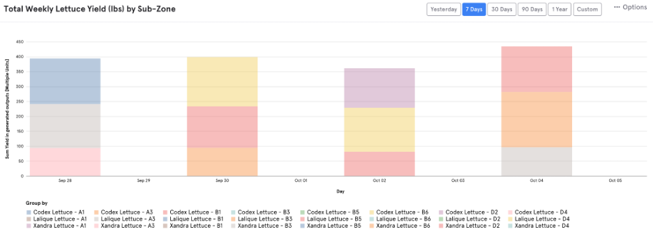
Though you can group by more than two categories, we recommend limiting this to two for chart readability.
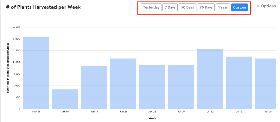
Artemis has also added expanded options for quickly selecting new date ranges for each chart. Previously users had to click into the chart panel and manually select a new start and end date. Now, users can also select rolling date windows without having to open the chart panel, making exploring different time ranges much faster. Users can quickly see data from yesterday, the last 7 days, 30 days, 90 days or a year.
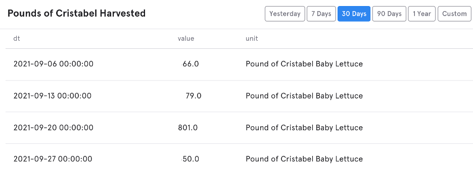
Additional improvements all center around saving time and ease of use when creating and editing charts. The default chart type is now “table” which gives you a quick view into your data. We added the option to duplicate a chart, which is a huge time saver especially for users who apply a lot of filters. We also sped up the time it takes to load charts, add filters, and many more small fixes that make it easier to edit and read charts.
The iUNU team is now turning our attention to user feedback around data science improvements to Artemis’ reports, so stay tuned for exciting reporting additions to come!


Leave A Comment